Artwork Breakdown
My process
With my art style, I spent a lot of time over the years trying to create realistic or highly detailed, well‑proportioned drawings. I still struggle with them, but focusing so much on high‑rendered 2D content gave me a solid foundation for what I create now. It gave me the confidence to branch out, sharpened my eye for shapes, and helped me be bolder with my choices and do what worked for me.
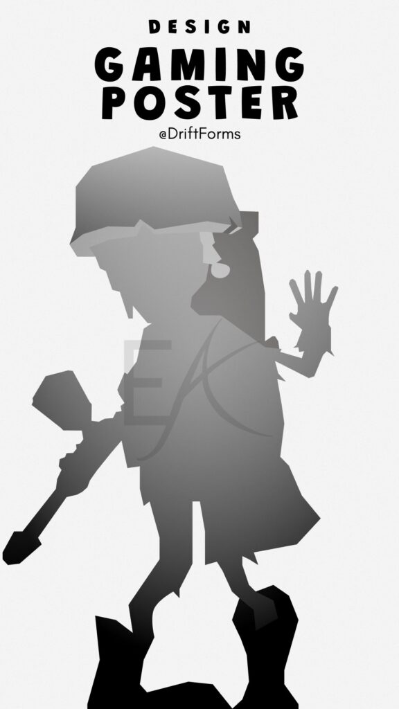
What surprised me at first was how much I enjoyed keeping things monochrome. I began figuring out how to make iconic characters (ones that rely heavily on colour) instantly recognisable through other traits. It is now teaching me how to bring that same iconic, instantly recognisable feel into my current pieces. My work draws heavily from silhouette, and a good character design will always have a recognisable shape, no matter how much detail is placed on top.
When I am creating my artwork, I look for references and then lock onto a poster design I like. Usually, it is just the character that I recreate in my style, sometimes with text placement inspired by the original poster if it is well known. That text element is what I consider a secondary component; it isn’t the main focus, but it adds to the world the character is from. This isn’t always the case, as I also create animal and mythical creature posters.
With any design, I look for:
– Shadows
– Sharp contrasts
– Negative space to see the shapes they form and connect them piece by piece.